Sunday, November 11, 2007

A very bad host

Well, I have been rather remiss in my blogging duties and have not fulfilled the role of a good host. My apologies - the collecting bug has been soooooo strong recently that I have found very little time to pull myself away from staring, sometimes rather peculiarly and more often inappropriately at my collection (we pottery collectors are a very weird bunch indeed - at least so I found on a recent visit to the Stoke-on-Trent Ceramics festival). I have been encouraged to do more, however, by recent visitors and their messages; at last, some other Victorian pottery fans! I was beginning to think I was the only one in the village. It may still be early days to think of starting a Powell Bishop & Stonier or BISTO (non-gravy of course) collectors club as two or three members constitutes more of a menage than a bachanalian orgy of ceramic lust, but it's a start. And if I can go some way to tempting errant Carltonware, Wedgewood or Meakin (curator at The Potteries Museum, you know who you are ;-) collectors away from their perverse desires, so much the better.

Well, on with the blog...

One of the ways of proving yourself a good host in the Victorian period was to put on a good spread! Tea, coffee, sandwiches, cake and biscuits were all part of the Victorian's charm offensive. Just as today, people's everyday tableware was usually different to that used for guests and special ocassions; they were usually of better quality, more intricate or patterned and intended to show off the host's good taste and wealth. There were all sorts of manners and rituals around "high tea" - you can even now visit a rather peculiar tearoom in Brighton where the owner scorns if you dare dunk your biscuits in homage to the traditional etiquette of taking tea ( i'm afraid i can't remember the name of it, but i'm sure you'll find it on the internet). My collection has a few full & part teasets and coffeesets which i would like to share with you. This first coffee set is a fantastic art deco Bisto collection: a white porcelain body with black Egyptian inspired scarab type motifs and banding. It was an absolute steal on Ebay because of the badly listed title and poor photos so I was delighted to be able to add it to my collection so affordably. The Egyptian theme was very prominant in the early part of the 20th century because of Howard Carter's exploration of the Valley of the Kings and the discovery of Tutankamun's tomb. Hyroglyphs, egyptian motifs and "orientalist" scenes of deserts and camel riders were popular. In other arts, fantastic photographers like Zangaki and Lehnert & Landrock brought images of the mystical east to the gagging European market.

This part coffeeset ( i'm missing a cup and the coffee pot - if you know of any, do tell me!) is from around 1890-1900 and is very definitely an aesthetic movement design (I have previously written about the motifs and merits of this movement). It comes from the Oriental Ivory range and is very stylish in it's simple use of colour - coming away from the multi-enamelled pieces from a few years earlier. It is the beginning of a period when design became less fussy and cluttered and in a sense, more minimal - a precurssor to sharp and simple deco design.

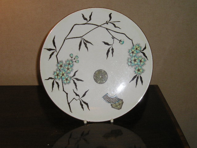
This coffeeset ( i have previously featured one cup, but only recently managed to purchase the rest of the set) is again from the Aesthetic movement period and draws heavy influence from Japanese design. The colour scheme of black and orange transfers with small areas of turquoise enamels is extremely stylish and is perfectly finished off by the gilded edges. The fantastic octagonal shapes are delightful and illustrate the fine quality of this set as it was certainly not cheap to produce wares like this. This is a bone china Bisto piece and bears the wand of caduceus mark so must have been made some time soon after the company became Bishop & Stonier. I have also seen the same design in a red transfer colourway but i must say I prefer this version.

I recently took the teapot from this set to an Antiques Roadshow valuation day and met expert Fergus Gambon - son of Michael (Dumbledore) Gambon. He assured me that these kind of sets were indeed made with only two cups and saucers, probably for a husband and wife to enjoy tea in bed, brought by their maid servant! I had previously wondered if the whole "tea for two" thing was something that was made up by dealers who had broken 4-cup teasets and thought a "tete-a-tete" sounded better than a four piece with one broken cup and a chipped saucer. Fergus's valuation was very satisfying as he said it should fetch at least £200 for such a stylish aesthetic set.

Sunday, December 03, 2006

Dragons

The classroom bit... There has long been a fascination in the West for all things "Oriental" and this desire has been played out in many fields. The idea of 'the Orient' is usually as a mystical, colourful, sensual, ritualistic place, spanning from the Middle East with the pyramids in Egypt to the Far East of Asia and the temples of Japan. Our society seems to hold an interest in all things "other" and Orientalism was an artistic tradition that utilised the aesthetic traditions and motifs of those far off foreign lands to fulfill a European need for fantasy. In the 17th and 18th centuries, it was almost unheard of for anyone but merchants to make the perilous journey to Asia. Traditional Blue & White pottery and earthenwares were brought back to Europe in huge quantities to satisfy popular demand. Native British potteries, mainly in the Staffordshire region then decided to cut out the middle men and started to produce their own oriental style wares and so began the rise and rise of well known names like Bow, Worcester and Caughley. For the Victorians and then the Edwardians, the Far East had become a place where more and more people could travel and souvenir wares flooded the nations homes. There was another surge in oriental inspired design in homegrown European art and crafts. The Aesthetic movement drew heavily upon Japanese design and the phrase "Japonism" is often used to describe pieces of this time and type. Design motifs like fans, freizes, cherry blossoms, water lilies, finches and dragons were applied to all sorts of things from wardrobes to tea sets. For pottery and porcelain, oriental inspired design had begun two centuries earlier with what is now called 'Chinoiserie'. The fashion for Chinoiserie design has come and gone several times over the past few centuries and in various incarnations and it found popularity once again in the deco period of the 1920s/30s. Artists and artisans have often used loosely oriental looking scenes - sometimes direct copies of Chinese or Japanese originals, or more frequently, fantasies based on oriental motifs such as: pagodas, fences, chrysanthemums and people with pointy hats carrying parasols. In the original Chinese and Japanese designs, these motifs were used like a language and often symbolised ideas that the people who saw them would recognise and be able to interpret, much like religious symbolism in early Western art. The visual symbolistic language of the originals was lost in translation however when it was copied and ammended towards western tastes. Powell Bishop & Stonier began their association with oriental inspired design with their Aesthetic movement pieces in the late 1870s and 1880s. Their 'Oriental Ivory' range utilised familiar western interpretations of oriental design such as those already mentioned. On an ivory coloured base, they applied numerous chinoiserie/japonism/aesthetic designs, often using a transfer print, coloured enamels and gilding. Victorian design is often labelled as heavy, clunky and OTT in it's application, but the Aesthetic movement and simultaneously, the Arts & Crafts movement began to lighten the mood and gave design, room to breath. Mid-Victorian design often filled every available inch of space with pattern and colour, but as the century progressed, we can see a trend towards more roomy compositions, often assymetrical. Fans, frames and freizes were strong structural devices that sat next to organic foliate designs. This juxtaposition is perhaps the Aesthetic movement's most obvious signature style. When Art Deco came along, assymetry seemed to fall out of favour to more symmetrical and geometric design. Some potteries took this change on board more easily than others and perhaps it was something to do with this that Bishop & Stonier finally found that the wolf at their door would not go away and the company was bought out by George Jones (although they continued to use the Bisto trademark). Interestingly, George Jones had produced many similar wares to Bishop & Stonier for many years, but they seemed to be able to adapt more easily to the more angular, jazzy styles that started to infiltrate the market from the 1930s onwards and ultimately saw designers like Clarice Cliff and Charlotte Rhead take centre stage.
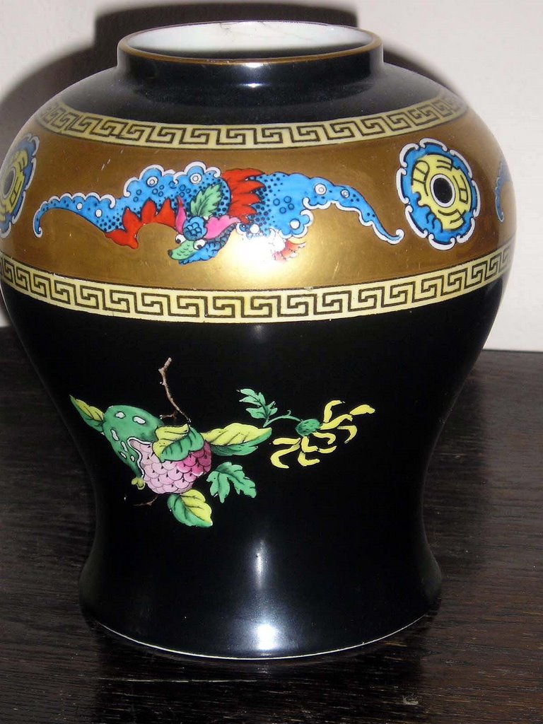
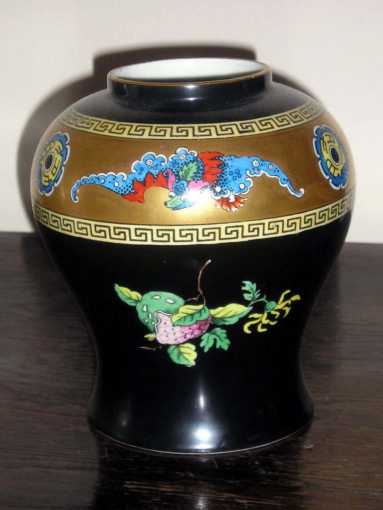
My collection... I have several pieces in my Powell / Bishop & Stonier collection that have oriental-type designs. Some of my Oriental Ivory pieces I have already discussed in a previous post but as discussed, the oriental theme was re-interpreted in the 20th century in Art Deco designs. One example of this is a baluster vase which has a freize of dragons and oriental wheels, banded by a Greek key design. Below the freize are fruit and flower vignettes on a ground colour of black. Black seemed to be a popular colour for Art Deco design because of it's strong graphic quality which drew attention to form and individual motifs. When described like this, it appears to be rather a mish-max of design ideas and indeed, it is not to everyones taste.
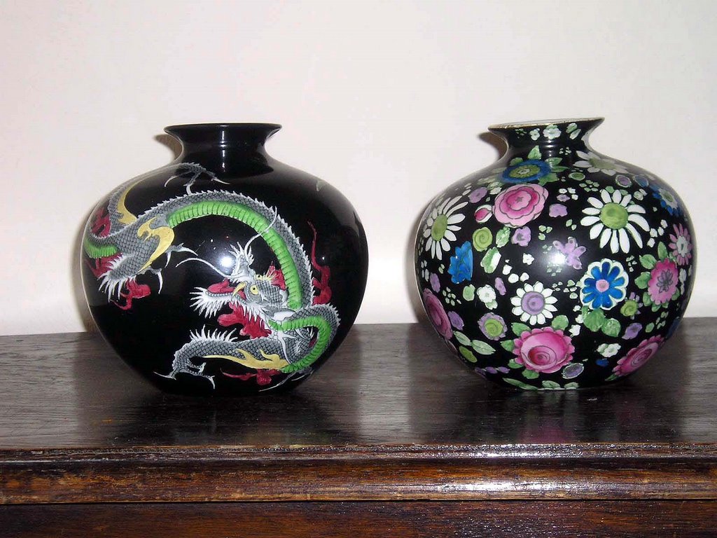
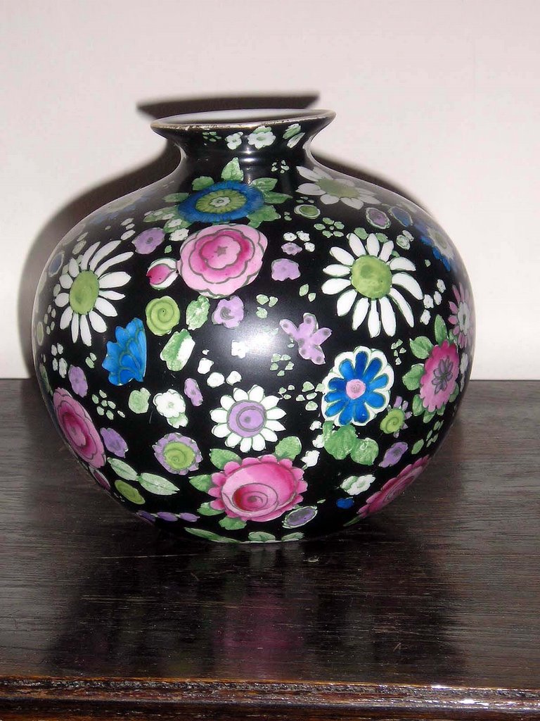
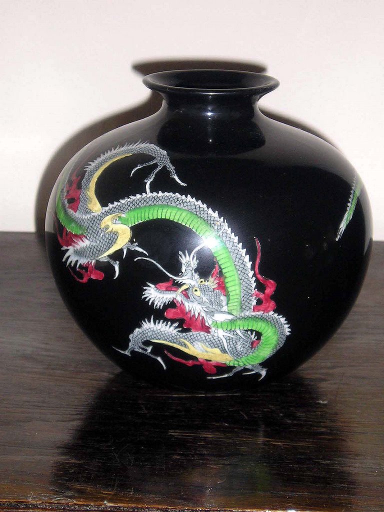
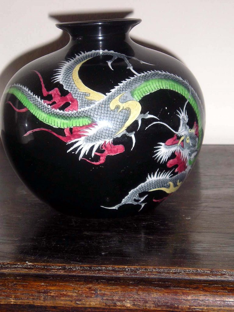
Another Bisto piece in my collection is a globe shaped vase which again has black ground and a large green and red dragon winds its way around the entire body. It crys out to be handled and turned around in your hands so that your eyes can trace the design. I have another vase of exactly the same body shape, again with a black background, but this time with pastel coloured flower heads; the flowers are transfer printed and individually hand-painted in enamels. Although this vase again is not to even's taste, it does have an integrity to the design. It's almost an Art Deco interpretation of Chintz.
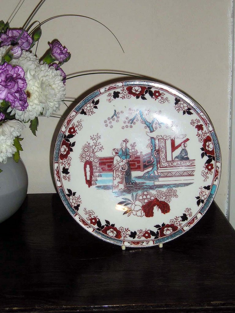
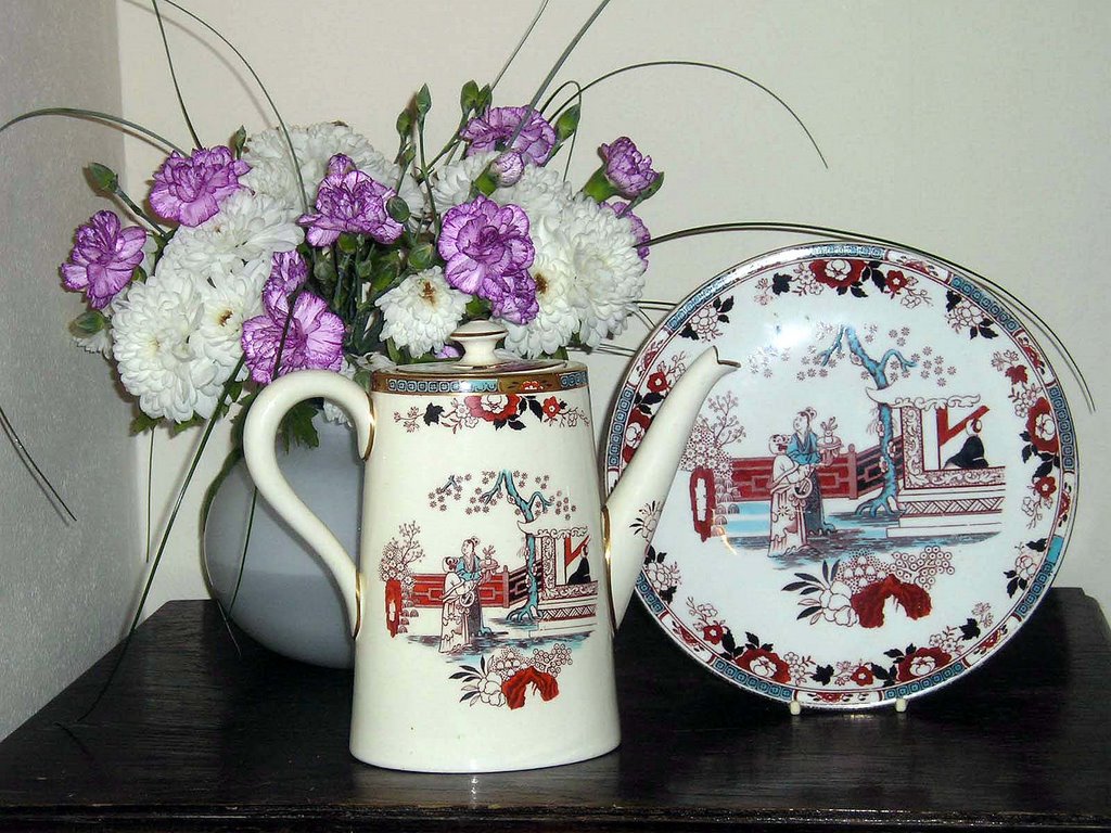
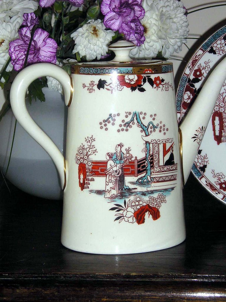
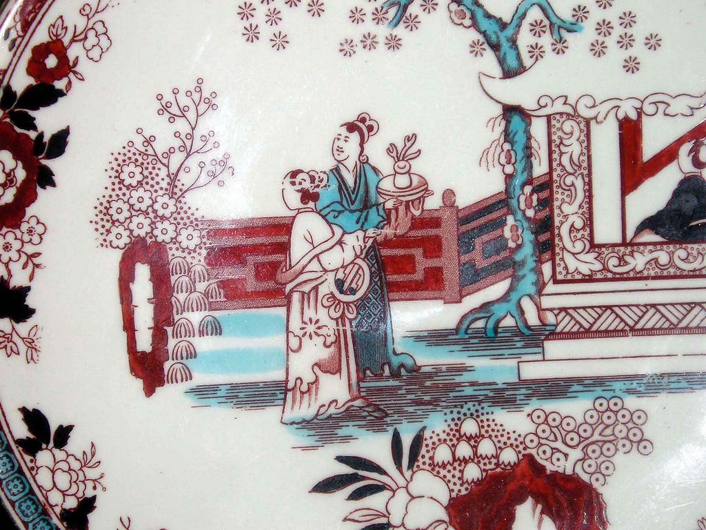
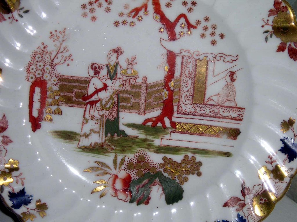
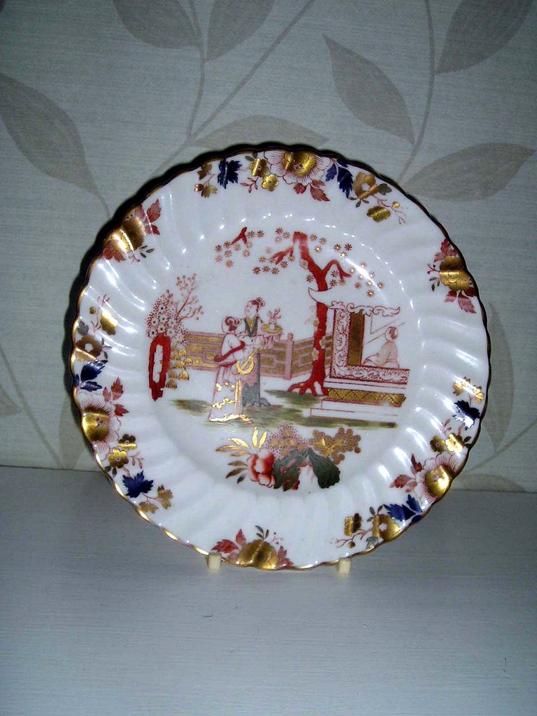
Some patterns were so popular (notably the 'Willow pattern') that they were used for absolutely everything and in so many variations that they are almost iconic; the Blue & White Willow pattern has come to represent a certain type of Englishness and English style found on countless pine dressers across the land. The Indian Tree pattern was another extremely popular pattern that many potteries used. One chinoiserie design that Bishop & Stonier used was the so-called Tea House pattern which showed two japanes figures standing outside a house whilst another figure looks out from a window. Cherry blossom, or prunus trees frame the scene. The benefit of using and re-using patterns was that for customers who could not afford to buy a whole dinner service in one go, they could keep going back to a retailer to build up their collection.
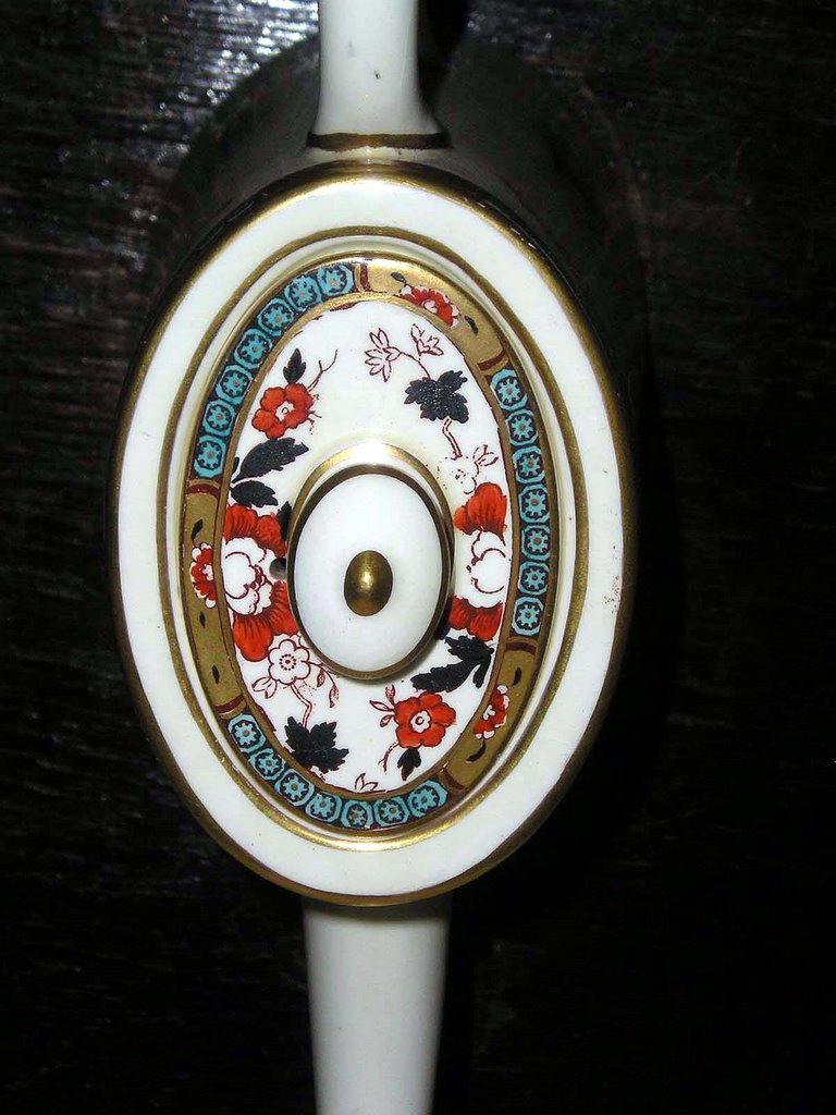
I have a couple of items in my collection that use the Tea House pattern, but have different colour variations. Most recently I acquired a large and splendid coffeepot, which is part of the Oriental Ivory range. The pattern is in a pinky red and turquoise type blue colouring, with gilded highlights. The body shape is quite plain and tends towards the Art Deco, but the pattern design is hinting back to Victorian Chinoiserie tastes. The design and colour of this piece fits very well in a 21st century modern home, and the turquoise colour is very "now". I have a dinner plate with the same pattern, but the pottery body colour is whiter than the ivory coffeepot.
Another piece in my collection, is a side plate, with a spiral ribbed design. This time the pattern is in a iron red and green colouration, again with gilding.

Thursday, August 10, 2006

Oriental Ivory

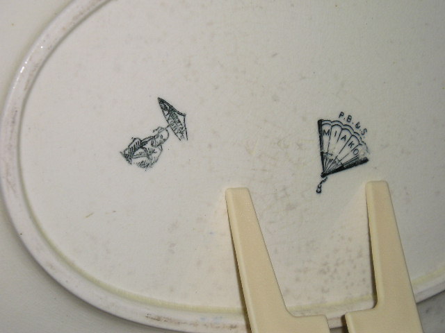
So, here is my collection of Powell, Bishop & Stonier (P.B&S) in the Oriental Ivory range with the chinaman+parasol backstamp. It's interesting to note the variety of patterns, from very obvious oriental inspired designs, to very un-oriental ones which simply used the ivory body.

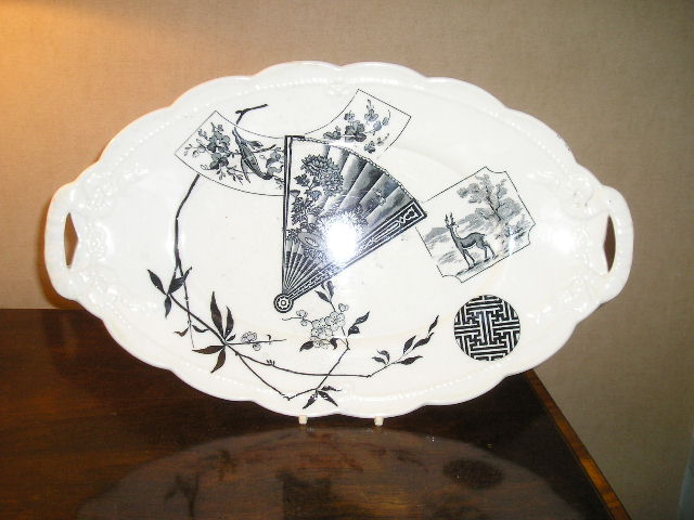
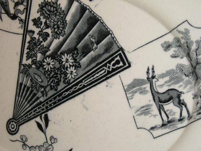
Some shapes were used over and over again with different patterns sometimes completely ignoring other design elements of the piece such as moulded reliefs- best illutrated by my Miako pattern platter which overlays a printed design on a rather more sugary ribbon and rope moulded relief.

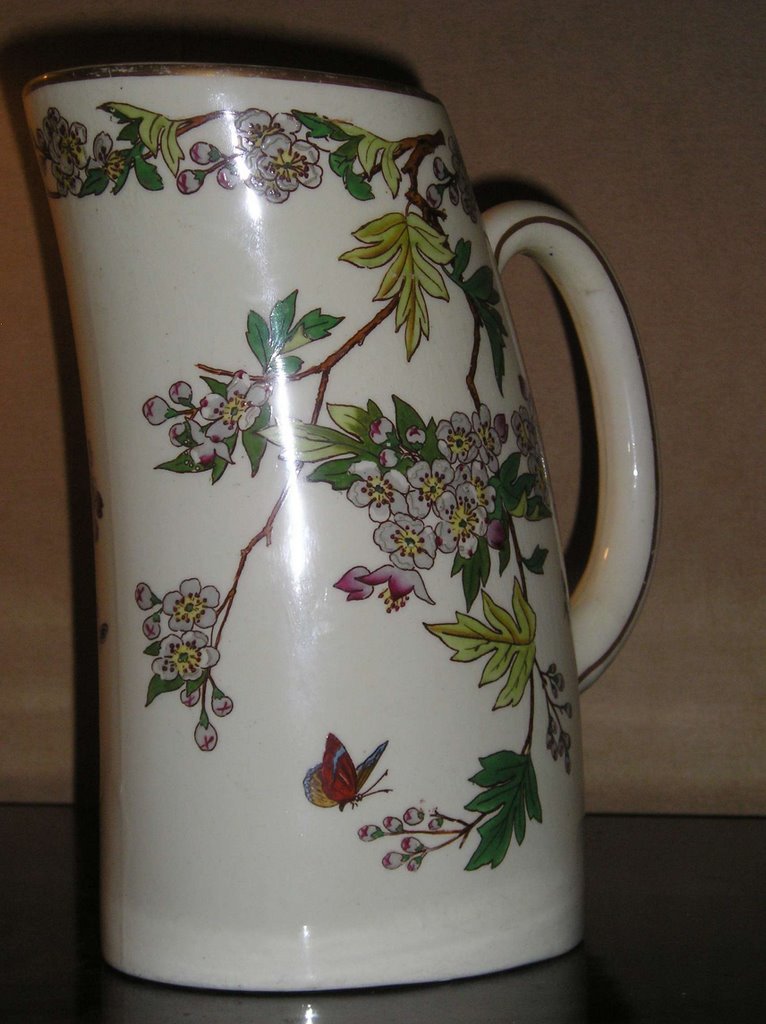
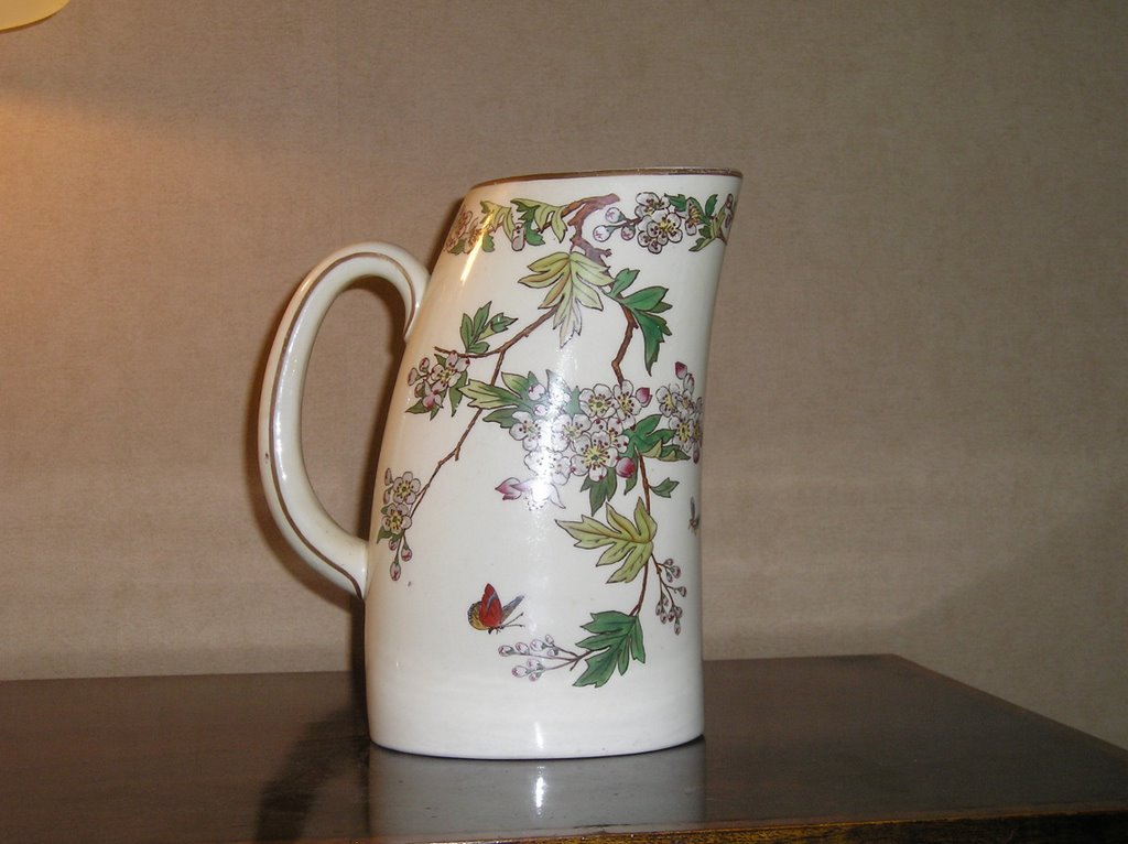
The oriental inspired designs were very often very stylized to fit the fashionable Aesthetic Movement look, with motifs like fans, chinese wheels, freizes and picturesque landscapes. Other pieces used a botanical idea for a more traditional English look, such as this jug. Interestingly, the shape of the jug hints at a move towards more Art Deco geometric body shapes.

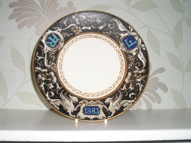
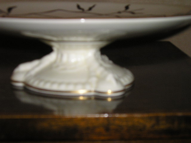
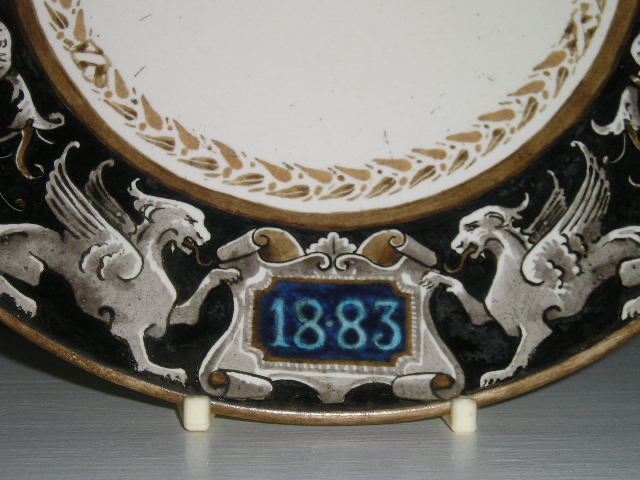
I have two tazzas with eagle claw moulded trefoil bases. They have two very different designs: 'Mikado' , an oriental inspired aesthetic design and a hand-painted armourial design (probably a special commission) with heraldic beasts, intials (AR & F) and a date of 1883. It also has a latin phrase,"Virtue non armis fido". If anyone can tell me what this means, i'd be very grateful! I have also seen the same body shape with a nursery rhyme theme (these were commonly produced in 1920s/30s and mostly on childrens teasets and beakers etc).

About Me

My photo
Sometimes, life doesn't turn out the way you expected. And sometimes, it is exactly as it was 'meant' to be. I believe that life is a both a learning experience and an obstacle course to be climbed and clambered over in the most creative way possible! In doing so, you'll get to where you should be even if it's not where you'd imagined.