
Sunday, December 03, 2006
Dragons
The classroom bit...
There has long been a fascination in the West for all things "Oriental" and this desire has been played out in many fields. The idea of 'the Orient' is usually as a mystical, colourful, sensual, ritualistic place, spanning from the Middle East with the pyramids in Egypt to the Far East of Asia and the temples of Japan. Our society seems to hold an interest in all things "other" and Orientalism was an artistic tradition that utilised the aesthetic traditions and motifs of those far off foreign lands to fulfill a European need for fantasy. In the 17th and 18th centuries, it was almost unheard of for anyone but merchants to make the perilous journey to Asia. Traditional Blue & White pottery and earthenwares were brought back to Europe in huge quantities to satisfy popular demand. Native British potteries, mainly in the Staffordshire region then decided to cut out the middle men and started to produce their own oriental style wares and so began the rise and rise of well known names like Bow, Worcester and Caughley.
For the Victorians and then the Edwardians, the Far East had become a place where more and more people could travel and souvenir wares flooded the nations homes. There was another surge in oriental inspired design in homegrown European art and crafts. The Aesthetic movement drew heavily upon Japanese design and the phrase "Japonism" is often used to describe pieces of this time and type. Design motifs like fans, freizes, cherry blossoms, water lilies, finches and dragons were applied to all sorts of things from wardrobes to tea sets. For pottery and porcelain, oriental inspired design had begun two centuries earlier with what is now called 'Chinoiserie'. The fashion for Chinoiserie design has come and gone several times over the past few centuries and in various incarnations and it found popularity once again in the deco period of the 1920s/30s. Artists and artisans have often used loosely oriental looking scenes - sometimes direct copies of Chinese or Japanese originals, or more frequently, fantasies based on oriental motifs such as: pagodas, fences, chrysanthemums and people with pointy hats carrying parasols. In the original Chinese and Japanese designs, these motifs were used like a language and often symbolised ideas that the people who saw them would recognise and be able to interpret, much like religious symbolism in early Western art. The visual symbolistic language of the originals was lost in translation however when it was copied and ammended towards western tastes.
Powell Bishop & Stonier began their association with oriental inspired design with their Aesthetic movement pieces in the late 1870s and 1880s. Their 'Oriental Ivory' range utilised familiar western interpretations of oriental design such as those already mentioned. On an ivory coloured base, they applied numerous chinoiserie/japonism/aesthetic designs, often using a transfer print, coloured enamels and gilding. Victorian design is often labelled as heavy, clunky and OTT in it's application, but the Aesthetic movement and simultaneously, the Arts & Crafts movement began to lighten the mood and gave design, room to breath. Mid-Victorian design often filled every available inch of space with pattern and colour, but as the century progressed, we can see a trend towards more roomy compositions, often assymetrical. Fans, frames and freizes were strong structural devices that sat next to organic foliate designs. This juxtaposition is perhaps the Aesthetic movement's most obvious signature style. When Art Deco came along, assymetry seemed to fall out of favour to more symmetrical and geometric design. Some potteries took this change on board more easily than others and perhaps it was something to do with this that Bishop & Stonier finally found that the wolf at their door would not go away and the company was bought out by George Jones (although they continued to use the Bisto trademark). Interestingly, George Jones had produced many similar wares to Bishop & Stonier for many years, but they seemed to be able to adapt more easily to the more angular, jazzy styles that started to infiltrate the market from the 1930s onwards and ultimately saw designers like Clarice Cliff and Charlotte Rhead take centre stage.
My collection...
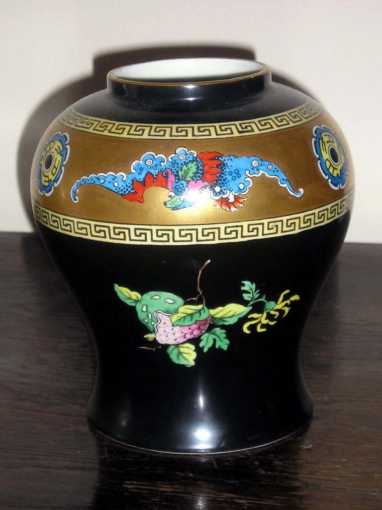
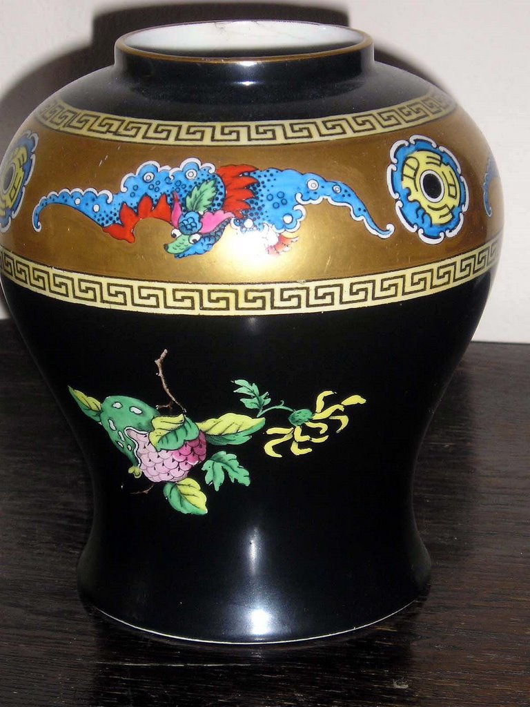
I have several pieces in my Powell / Bishop & Stonier collection that have oriental-type designs. Some of my Oriental Ivory pieces I have already discussed in a previous post but as discussed, the oriental theme was re-interpreted in the 20th century in Art Deco designs. One example of this is a baluster vase which has a freize of dragons and oriental wheels, banded by a Greek key design. Below the freize are fruit and flower vignettes on a ground colour of black. Black seemed to be a popular colour for Art Deco design because of it's strong graphic quality which drew attention to form and individual motifs. When described like this, it appears to be rather a mish-max of design ideas and indeed, it is not to everyones taste.
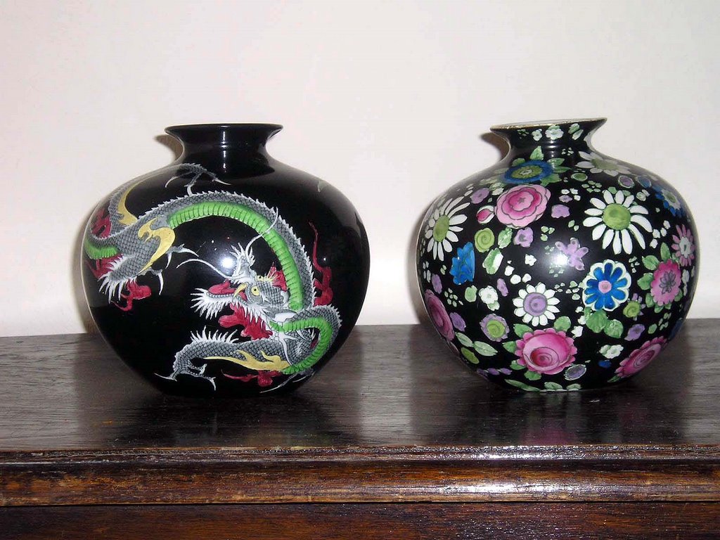
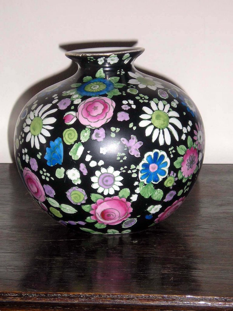
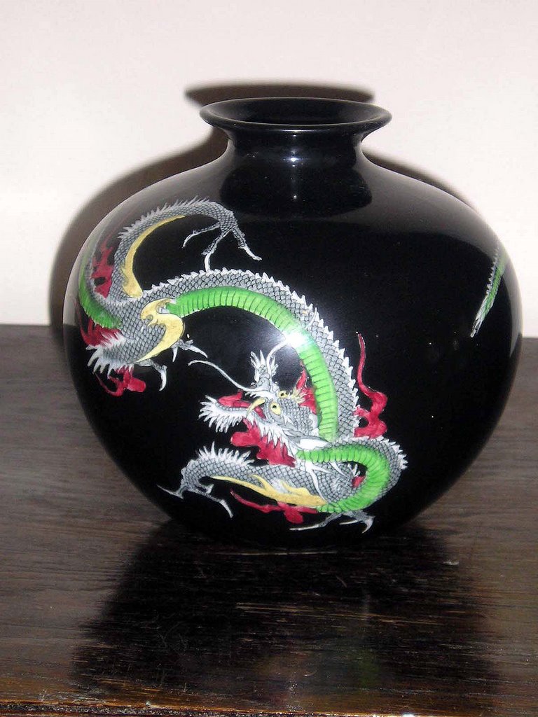
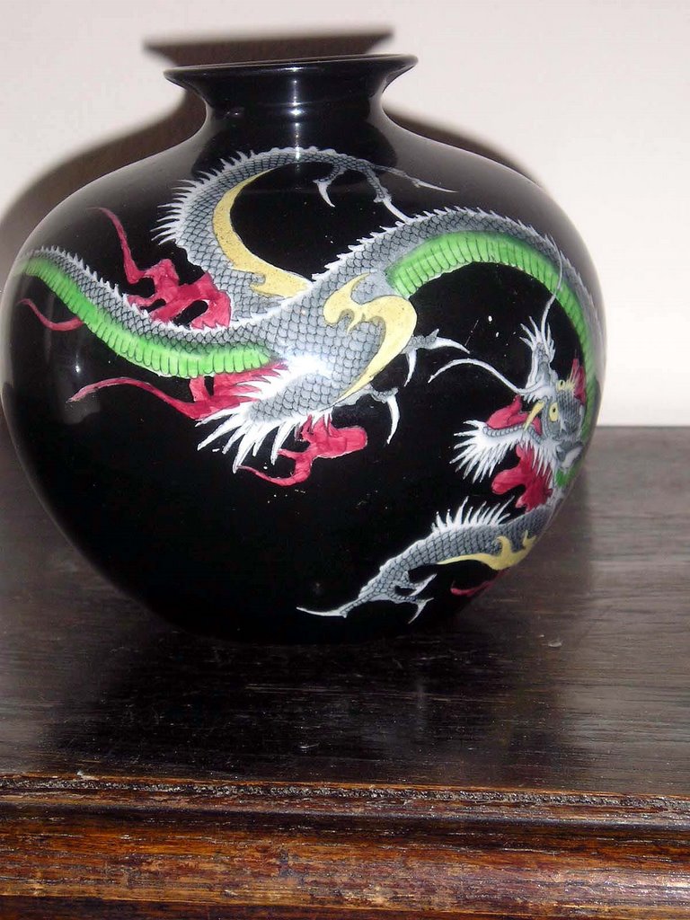
Another Bisto piece in my collection is a globe shaped vase which again has black ground and a large green and red dragon winds its way around the entire body. It crys out to be handled and turned around in your hands so that your eyes can trace the design. I have another vase of exactly the same body shape, again with a black background, but this time with pastel coloured flower heads; the flowers are transfer printed and individually hand-painted in enamels. Although this vase again is not to even's taste, it does have an integrity to the design. It's almost an Art Deco interpretation of Chintz.
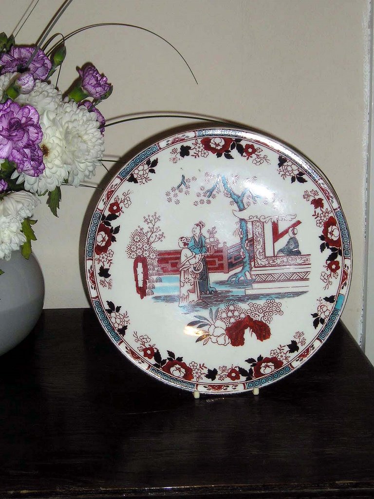
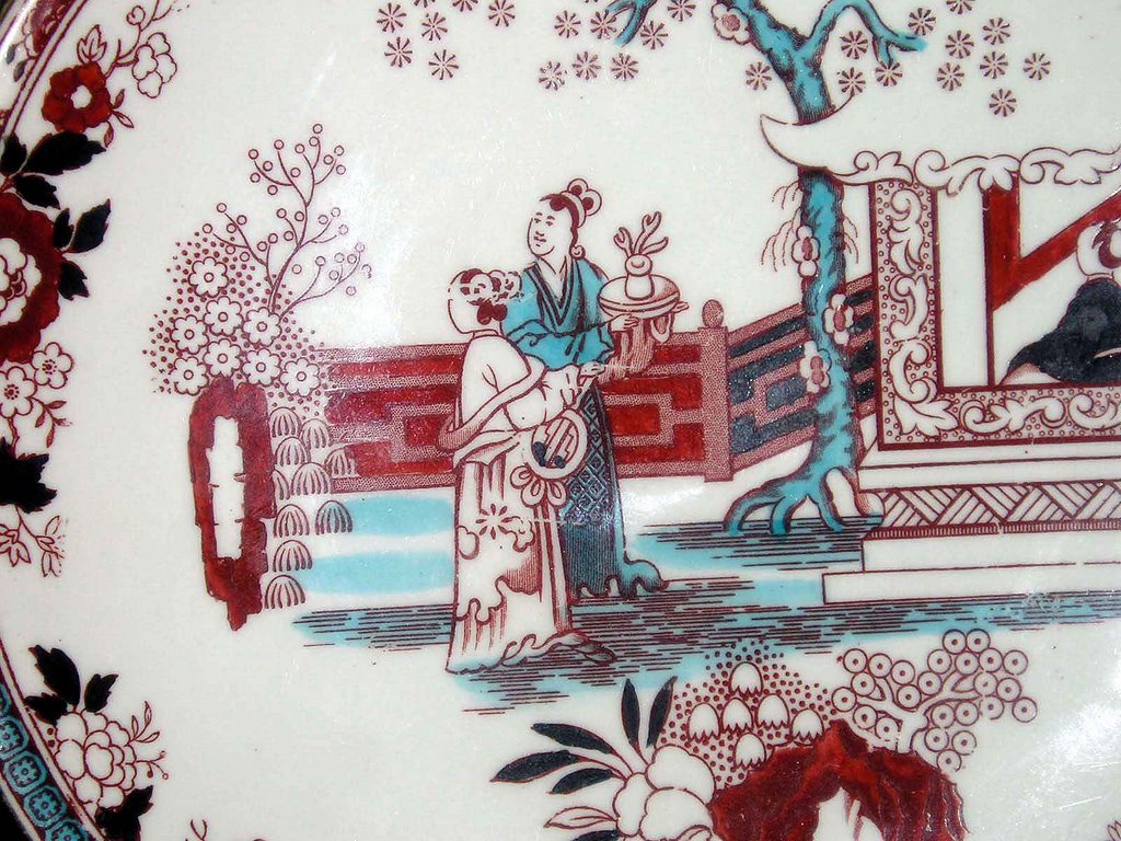
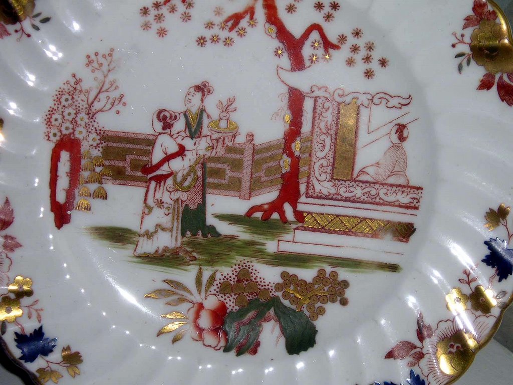
Some patterns were so popular (notably the 'Willow pattern') that they were used for absolutely everything and in so many variations that they are almost iconic; the Blue & White Willow pattern has come to represent a certain type of Englishness and English style found on countless pine dressers across the land. The Indian Tree pattern was another extremely popular pattern that many potteries used. One chinoiserie design that Bishop & Stonier used was the so-called Tea House pattern which showed two japanes figures standing outside a house whilst another figure looks out from a window. Cherry blossom, or prunus trees frame the scene. The benefit of using and re-using patterns was that for customers who could not afford to buy a whole dinner service in one go, they could keep going back to a retailer to build up their collection.
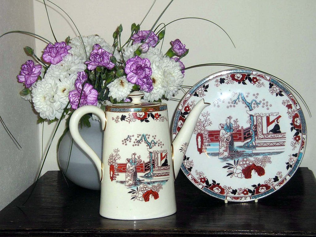
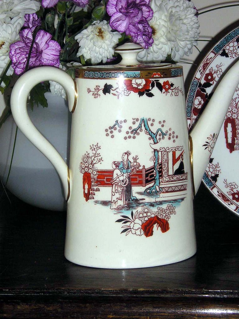
I have a couple of items in my collection that use the Tea House pattern, but have different colour variations. Most recently I acquired a large and splendid coffeepot, which is part of the Oriental Ivory range. The pattern is in a pinky red and turquoise type blue colouring, with gilded highlights. The body shape is quite plain and tends towards the Art Deco, but the pattern design is hinting back to Victorian Chinoiserie tastes. The design and colour of this piece fits very well in a 21st century modern home, and the turquoise colour is very "now". I have a dinner plate with the same pattern, but the pottery body colour is whiter than the ivory coffeepot.
Thursday, August 10, 2006
Oriental Ivory
 So, here is my collection of Powell, Bishop & Stonier (P.B&S) in the Oriental Ivory range with the chinaman+parasol backstamp. It's interesting to note the variety of patterns, from very obvious oriental inspired designs, to very un-oriental ones which simply used the ivory body.
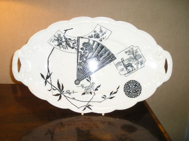
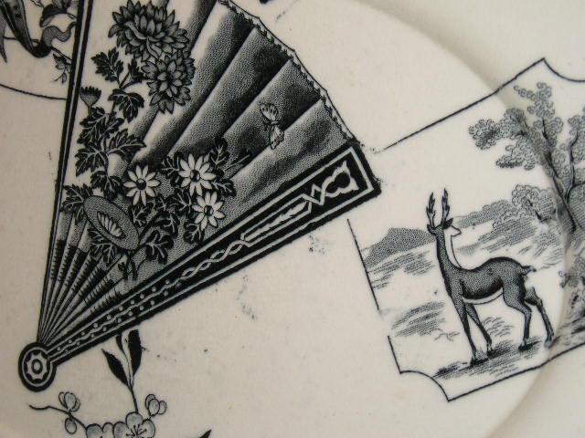
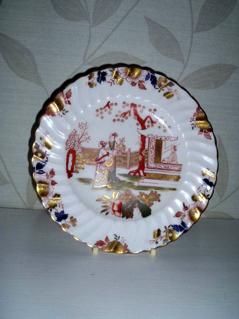
Some shapes were used over and over again with different patterns sometimes completely ignoring other design elements of the piece such as moulded reliefs- best illutrated by my Miako pattern platter which overlays a printed design on a rather more sugary ribbon and rope moulded relief.
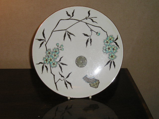
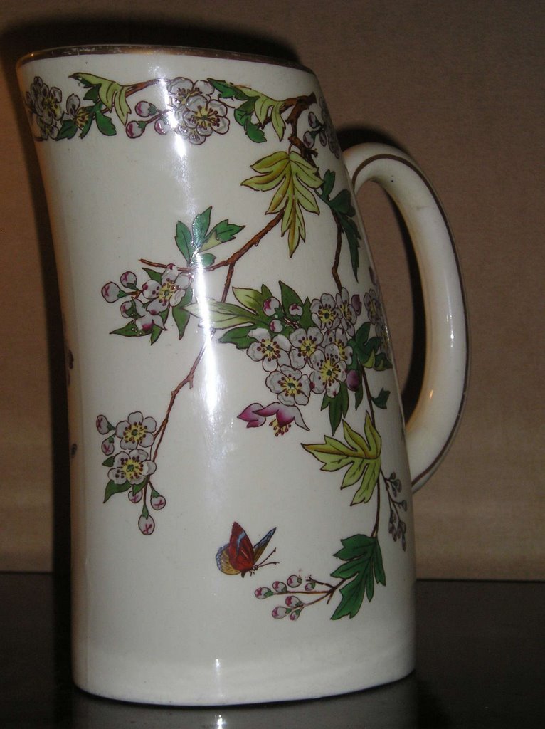
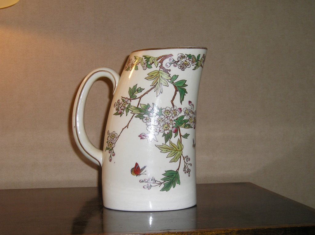
The oriental inspired designs were very often very stylized to fit the fashionable Aesthetic Movement look, with motifs like fans, chinese wheels, freizes and picturesque landscapes. Other pieces used a botanical idea for a more traditional English look, such as this jug. Interestingly, the shape of the jug hints at a move towards more Art Deco geometric body shapes.
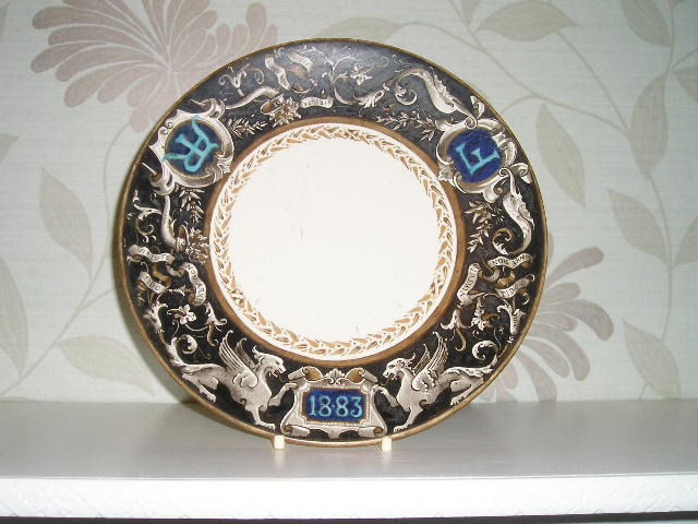


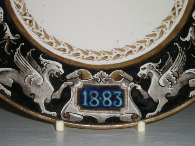
 I have two tazzas with eagle claw moulded trefoil bases. They have two very different designs:
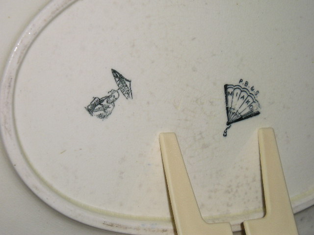
'Mikado' , an oriental inspired aesthetic design and a hand-painted armourial design (probably a special commission) with heraldic beasts, intials (AR & F) and a date of 1883.
It also has a latin phrase,"Virtue non armis fido".
If anyone can tell me what this means, i'd be very grateful! I have also seen the same body shape with a nursery rhyme theme (these were commonly produced in 1920s/30s and mostly on childrens teasets and beakers etc).
I have two tazzas with eagle claw moulded trefoil bases. They have two very different designs:
'Mikado' , an oriental inspired aesthetic design and a hand-painted armourial design (probably a special commission) with heraldic beasts, intials (AR & F) and a date of 1883.
It also has a latin phrase,"Virtue non armis fido".
If anyone can tell me what this means, i'd be very grateful! I have also seen the same body shape with a nursery rhyme theme (these were commonly produced in 1920s/30s and mostly on childrens teasets and beakers etc).


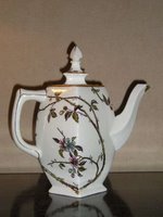
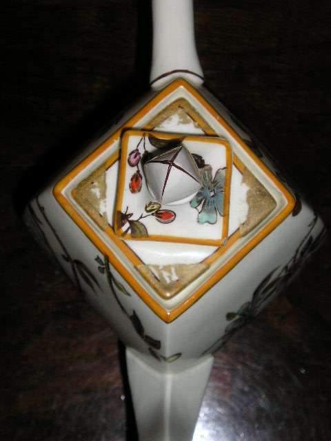
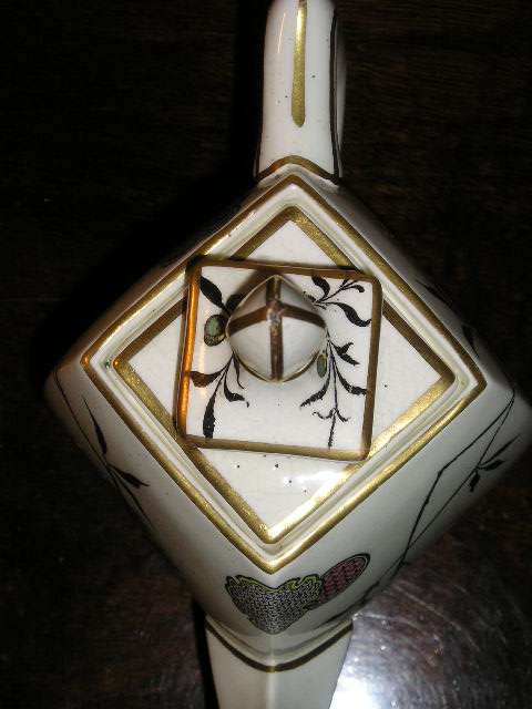
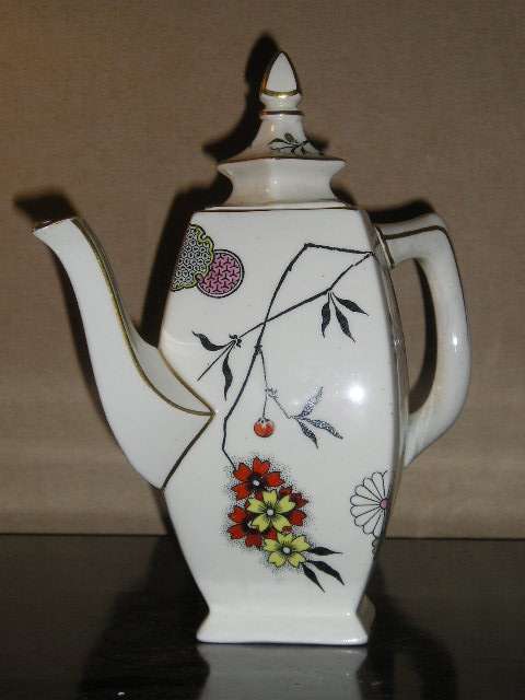
 Other pieces in my collection that follow on from the oriental ivory look are two coffeepots which have gorgeous foliage and oriental motifs. The two printed designs are similar and use the same body shape - a cuboid shaped pot.
Curiously, it was some time before George Clews patented his Cube teapot that was widely used by Cunard on cruise ships during the Art Deco period. P.B&S were ahead of their time!
Other pieces in my collection that follow on from the oriental ivory look are two coffeepots which have gorgeous foliage and oriental motifs. The two printed designs are similar and use the same body shape - a cuboid shaped pot.
Curiously, it was some time before George Clews patented his Cube teapot that was widely used by Cunard on cruise ships during the Art Deco period. P.B&S were ahead of their time!
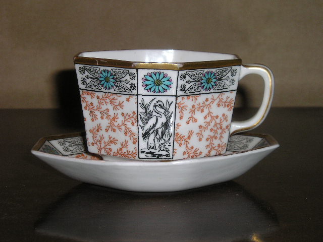
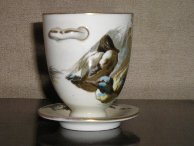
 Another unusually shaped object is this octagonal coffee cup and saucer - I believe it to be for coffee because of it's dainty size. The printed pattern is Japanese inspired with Cranes, water lillies and accanthas leaves. The taste for Japonism was everywhere in the 1890s from Pottery to wallpaper and furniture. Britains were beginning to explore the far east as tourists, just as they had done in Europe in the 18th and early 19th century on the "Grand Tour".
Wednesday, August 09, 2006
bisto barmey
Well, I guess you may have ended up here by mistake. Disappointed? Funny how a search for internet pornography can go so wrong. But also strangely pleasing to me that your desire to "get off" brought you here as that is exactly my point about pottery. Perhaps you're pleasantly surprised however, as you too share a fetish for all things ceramic and love to caress pots like a ripe bottom or ogle makers marks like a cute birth mark on the back of a loved-one's knee.
As you will have realised by now, there are no naked ladies or lithe lads to be found on these pages, just lots of gorgeous glazes, lovely lustres, erogenous enamels and curvaceous bodies. Under 18s, you can stay, but if you are of a weak disposition when it comes to vases and teapots...better leave now.
If you got here by mistake because you were looking for gravy related pages... you sicko!!! get outta here you freak!!!!!
I can't really say when my love of ceramics began, but I guess I've always been a fan of nick-nacks and ornaments etc. Although my family has never been the sort to line every shelf, mantle, and window sill with hideous figurines or gaudy Whitefriars vases. Growing up, there were always a few trinkets that crept into our domestic scenery: a black labrador puppy that stared with orange glazed eyes, a ghastly post-war japanese lithopane teaset that my dad inheritted, a set of crystal glasses that were accumulated from Texaco garages in reward for buying their petrol...all tat, but all firmly etched in my memory of my childhood and helping to form my love of "things".
I was so glad when the 90's ended, not least because it drew to a close my teenage years and a time of torment when I was coming out and "finding myself". But also because the 90's was all about minimalism and the decluttering of our lives and the rejection of "things". It seemed that everyone was after space and blandness. How boring! But the years since have thankfully seen a return of clutter; crappy things to buy and fill up your life with (if you've got a life). Perhaps we're going too far now and heading for a repeat of the 1980's excess story, but it can't be as bad as the fascistic minimalism of the 90s. I'm more of an 1890s man.
What's the point of this blog you're asking. Well, it's going to be pretty simple really. My intention is to post a few thoughts and findings about my own ceramic collection, illustrated with a few pics, and to invite your comments, suggestions and information to help build my knowledge (which is woefully lacking in some areas and mainly gleaned from TV progs like Flog-it and Antiques Roadshow). If you have a similar interest, I'd love to hear from you.
I originally started a collection of English Polychrome enamel chinoiserie porcelain; with makers such as Hilditch, New Hall, Rathbone, Machin. I had found a teacup and saucer in my local Oxfam shop, marked at £1.50 - a bargain I thought! And indeed it was for after some research, I discovered it was a pattern known as "lady with lyre" by Hilditch and probably worth something closer to £25. The boyfriend (callumjames.blogspot.com), delighted that I had finally found a geeky interest in something and now with a desire to "collect" (he's autistically OCD about collecting books) bought me a copy of 'Chinoiserie: Polychrome Decoration on Staffordshire Porcelain 1790-1850' by Howard Davis. A fascinating book with lots of detail about how the trend for Chinoiserie design in ceramics developed, changed and declined; also with lots of great illustrative photos - a MUST book for any collector of this type of pottery+porcelain.
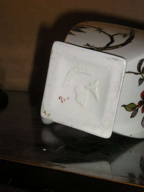
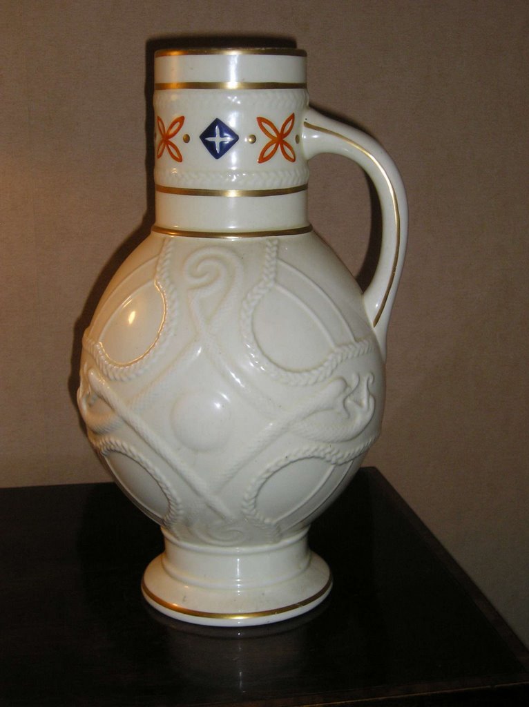 Not long after my first introduction to antique china, in the same Oxfam shop, I came across a large ivory coloured jug, for £10, with an amazing celtic cross design (made up of entwined serpents/dragons/sea creatures - not sure what they are!). I wondered if it might be classed as 'majolica' but settled on it just being 'moulded'. Is there a difference??? I had also recently bought a Miller's guide to Ceramics and was leafing through one evening when I saw a picture of my jug! Although the colouration was slightly different, it was definitely the same kind of jug and was priced at a healthy £70-80. The book had it listed as by a Staffordshire potter, but gave no further details. After lots of close inspection on the very faint makers mark on the bottom of the piece, I found it to be a Wand of Caduceus mark, employed by Powell & Bishop and later Powell, Bishop & Stonier in the late 1870s onwards. The ivory body colour of the jug was a precursor of P.B&S's "Oriental Ivory" range that cashed in on the Victorian's love of all things
 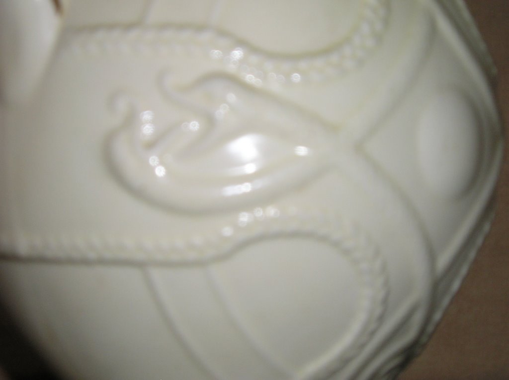 Oriental and the aesthetic movement's fascination with Japonism. The company used another mark for this particular range, a chinaman sitting under a parasol; very distinctive and rather cute. I love makers marks.
 Once I had found out a little about the history of the Powell, Bishop & Stonier (what little info there is on the internet), I looked around for other pieces. Surprisingly, there isn't a lot to be had, unlike the wealthy dirge of pieces by Wedgwood, Carltonware, Meakin, Johnson Bros etc. Admittedly, my budget is mainly restricted to Charity shops and Ebay, so I may be misrepresenting how common/rare P.B&S pieces are, but it seems to me that not a lot of their more interesting stuff has survived, or at least, comes on the market. There is more of the prozaic, mundane tableware around, just as there is for most victorian earthenware manufacturers, but larger, more decorative pieces are harder to come by. Perhaps this is a reflection of changing tastes as their orientalist work is very out of fashion nowadays and may have found it's way on to scrap-heaps.
Powell, Bishop & Stonier, became Bishop & Stonier when Edwin Powell retired. And B&S used these new initials as their mark along with the more recognisable 'BISTO' - a joining of their two names. In the 1930s, there was a brief period when the company became 'BISHOPS' before it was taken over by the George Jones factory. The BISTO company continued to produce the Oriental Ivory range for a time, but changing tastes at the start of the 20th century meant that they changed direction to produce more Art Nouveau and then Art Deco designs. The shapes and patterns they used were very commercial for the time and were retailed by company's like Harrods.
OK, I'm going on a bit now and forgive me if any of the info given so far is incorrect; as mentioned, all of it has been found on the internet and may be wrong. The best site I have found for this kind of thing is www.thepotteries.org so maybe you should check it out yourself.
Time to go for now I think because even if you're not bored yet, i'm getting there. Not by PB&S of course, but by trying to be entertaining and witty about it all. Surprisingly, intelligent and witty comments don't come that easily when I think about ceramics. I think it's must be more of an aesthetic thing and I'll leave the humour to someone else. Anyone got any pot jokes?
Subscribe to:
Posts (Atom)
About Me

- The Ticcy Knitter
- Sometimes, life doesn't turn out the way you expected. And sometimes, it is exactly as it was 'meant' to be. I believe that life is a both a learning experience and an obstacle course to be climbed and clambered over in the most creative way possible! In doing so, you'll get to where you should be even if it's not where you'd imagined.